- Do we add this one to the same hate list with Comic Sans? Not quite.
Typefaces – popularly known as “fonts” although that’s not quite correct – can be a sensitive issue. Just ask anybody what they think about Comic Sans or Papyrus.
Now we can add a new typeface to the list of controversial sets of lettering. The U.S. Court of Appeals district for the D.C. has officially recommended lawyers to not use a certain popular typeface.
The typeface in question is Garamond. To word nerds, this might seem like a strange case.
For those less savvy in the intricacies of type, a brief explanation is in order. Garamond is a centuries-old, popular typeface that is widely used in publishing.
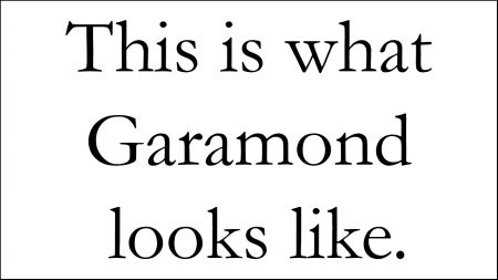
It’s often ranked as one of, if not the best font for books. If you’ve read any popular novels, including Harry Potter and Hunger Games, you have most certainly seen what Garamond looks like.
The typeface is not only for fiction, though. In 2014, a Pittsburgh middle school student calculated – as part of a science fair project – that the U.S. federal government could save $136 million in annual expenses if they changed the typeface on all official publications to Garamond.
That’s a pretty significant amount of money. So why in blazes is the Court of Appeals against Garamond? Do they just like wasting money?
Not Clear Enough
It might not surprise you to learn that the Court of Appeals has some incredibly strict rules in place for court documents. For example, all briefs must use a font size of at least 14, and the typeface must have serifs.
Oh, serifs are those little “jags” attached to letter ends. If you want a practical example, Arial is a sans serif typeface (it has no serifs), while Times New Roman is a serif typeface.
While Garamond does have serifs, the new court guidelines comes down to legibility. According to the Court of Appeals, Garamond just doesn’t cut it in terms of clarity.
“Briefs that use Garamond as the typeface can be more difficult to read and the use of this typeface is discouraged,” the new guideline reads.
Really? The best book typeface in the world isn’t clear enough for the courts?
The Court of Appeals justifies its decision by saying that Garamond appears smaller in the recommended font sizes than some other fonts. As such, the official court style guide has been updated to “discourage use of Garamond.”
So what typefaces should lawyers use then if Garamond out of all things isn’t clear enough?
“Certain typefaces, such as Century and Times New Roman, are more legible than others. The Court encourages the use of these typefaces,” the court notice says.
Ew, Times New Roman? Really? What is this, a middle school essay assignment?
‘Not a Good Font’
Naturally, the announcement of the style change hasn’t pleased everybody. Garamond remains a popular typeface among lawyers.
“[Garamond] is the only one I use. It looks nicer than Times New Roman,” an anonymous attorney told Fox News.
At least this author agrees with the attorney. But, style guides are style guides, and if you work in publishing, they have to be followed.
It is a blow to Garamond, though. As mentioned, the typeface has centuries of history behind it.
Garamond was originally created in the 16th century by French engraver Claude Garamond. The version we use today, though, is a modification that dates back to sometime in the 1920s.
But the courts aren’t completely wrong in calling Garamond less clear than other typefaces. Garamond is actually held back by its age – it doesn’t render all that well on modern computer screens.
“Amongst designers – especially print designers – Garamond is considered one of the best fonts in existence. It’s timeless, and very readable,” author and web designer David Kadavy writes in his blog.
“But, because of the limitations of current display technologies, it’s not a good font to use in web copy,” he admits.
The issue lies in the fact that many newer typefaces have been created particularly for computer displays. We’re going to bet that Claude Garamond wasn’t particularly concerned with that when he designed his creation in the 1500s.
To a Regular Joe’s eye, the rendering distortions with Garamond are probably barely noticeable, and at worst negligible. But when absolute clarity is key, like in court documents, these small mole hills turn into mountains.
Sorry, Garamond. Guess it is the old folks’ home for you, after all.
Improrer Overuse
Since we’re on the topic of typefaces and fonts, we thought we’d wrap this article up by addressing one question that might be puzzling some of you. Why do some people get so riled up by bad font choices?
Like we said in the beginning, Comic Sand and Papyrus in particular get design-oriented people up in arms. How can one the look of letters cause such a visceral reaction?
Well, just like with Garamond, sometimes the issue is with legibility. But with Comic Sans, it comes down to inappropriate use.
Comic Sans was never intended for serious contexts – its name is COMIC Sans for Pete’s sake. In the words of its creator, typographer Vincent Connare: “Comic dogs don’t talk in Times New Roman.”
The problem started when people who didn’t care quite so much about the rules of proper design started using Comic Sans. It began to appear in formal documents and posters, where it definitely doesn’t belong.
“I think a lot of the reasons people hate it is that it’s seen so often, and in places where it should not be used. The fact that it was being used outside of its rather limited purpose — that became obnoxious to people who knew better,” said professor of rhetoric and professional communication at Iowa State University, Jo Mackiewicz.
It’s a similar story with Papyrus. It’s used way too often in a context that doesn’t fit its purpose, which leads to overexposure to an unfitting font.
In short, people see Comic Sans and Papyrus where they don’t belong. And when they see it over and over again, it starts getting irritating.
Maybe we shouldn’t get so angry about how a bunch of words look. But man, if it isn’t annoying.