- Sometimes, the right font can make the keyboard mightier than the sword.
The right choice of typeface and font can make or break things in graphic design. Making a poor font choice could get your company or products ridiculed.
Or they could straight up ruin your life.
Font choices have caused some significant controversies over the years. From default PC fonts used in popular movie logos to bringing down entire governments, you’ll be surprised to find out just how big of an impact a font can make.
Here are six controversies and problems that were caused by someone picking the wrong font.
1. Avatar Logo Is (or Was) Just Papyrus
![]()
James Cameron’s sci-fi epic Avatar hit the theaters in 2009 and made a ridiculous amount of money (despite having shockingly little pop culture impact). However, when the movie started to be publicized, people noticed some oddly familiar about its logo.
It was written in Papyrus.
Papyrus is one of the default fonts delivered with Microsoft Windows, emulating text written with an old-timey calligraphy pen on textured paper. It has a somewhat bad reputation due to its overuse, with every new-age store and yoga studio using it on their brochures and websites.
Obviously, the font didn’t hamper Avatar’s success but it did draw a fair share of ridicule. Saturday Night Live, for instance, made an entire skit about it starring Ryan Gosling.
For the sequel movie Avatar: The Way of Water, Cameron opted for a custom typeface.
2. The Memory-boosting Font that Doesn’t Boost Memory
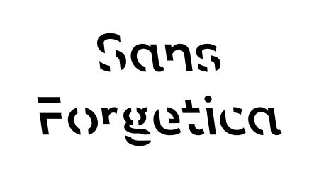
In 2018, a research team from Australia released Sans Forgetica. This strange font has parts of the letters missing.
Those missing parts are supposed to make the text harder and slower to read. According to its developers, this results in a scientifically proven increase in information retention and memory.
Except that it doesn’t.
A 2020 study, evaluating 882 people using paired tests with Sans Forgetica and another font, discovered that Sans Forgetica did jack to improve memory. If anything, it’s bizarre looks were more likely to cause typos and errors when using it.
It did slow down reading as the original publishers claimed. However, that apparently doesn’t translate to better memory, making Sans Forgetica just another funky, hard-to-read typeface.
3. Garamond and (Nonexistent) Government Cost Savings
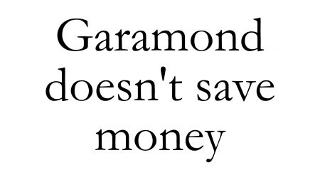
In 2014, a Pennsylvanian middle school student dropped a bomb on the U.S. federal government (figuratively). The student had calculated the differences in ink usage using different typefaces, and he claimed the government could save $136 million annually by switching to Garamond, a typeface often used in book publishing.
The student’s calculations were based on letters printed in Garamond being much thinner than those produced in similar serif typefaces, like Century Gothic.
Now, it’s true that Garamond produces thinner letters, but the student forgot to account for one thing. Garamond also prints the letters much smaller, so you’d have to bump up the font size significantly, which ends up virtually nullifying all of the cost savings.
In fact, Garamond appears so much smaller that the U.S. Court of Appeals banned its use in 2021.
4. Road Sign Money Grab

If you’re driving along in the U.S., the road signs you see will be written in Highway Gothic. Introduced in 1948, this has been the standard highway signage typeface for decades.
In 2004, that changed. The Federal Highway Administration released Clearview, a font with better visibility that was intended to replace Highway Gothic.
Soon after its release, however, an uncomfortable discovery came to light. The better signage visibility wasn’t due to the new font, but to better materials used to produce the signs.
Why did the FHA then claim that it was all due to the typeface?
Well, let’s just say that Highway Gothic is free to use. Meanwhile, local authorities have to pay the FHA up to $795 to license Clearview.
5. The German Font Debate That Hitler Settled
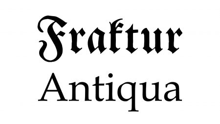
In Germany, a bitter debate raged from the early 19th century until World War II. The row centered around two typefaces: Fraktur and Antiqua.
Traditionally, Germany had used Fraktur, which looks like what you’ll probably picture when you think of old German text. However, in the early 1800s, Antiqua — a more modern and streamlined type — started creeping into Germany.
This caused a scandal. Conservatives argued that using Fraktur was part of the German national identity, which progressives believed it was positively medieval and Antiqua was the way of the future.
The argument went on for nearly 150 years until the Nazis came to power. Being German nationalists, they obviously favored Fraktur.
That was until 1941, when Hitler got it into his head that the centuries-old font was somehow a Jewish invention. It’s not, but that rang Fraktur’s death knell and the Nazi German government adopted Antiqua for good.
6. Calibri Brings Down Pakistani Government

Speaking of governments, let’s go back to 2016. This is the year when the Panama Papers, a huge pile of documents implicating powerful and famous people around the world of financial crimes, were published.
Among them was Pakistan’s then-prime minister Nawaz Sharif. According to the documents, Sharif and his family had used state funds to purchase several homes in London through shady and occasionally nonexistent businesses.
Sharif firmly denied the accusations. He and his family even produced original documents dated to February 2006 proving that they bought the house fair and square.
There was just one problem. The documents were written in Calibri.
This typeface, now a default part of the Windows font package, wasn’t released publicly by Microsoft until 2007. How was it possible that Sharif had original documents written in Calibri before its official release?
Well, of course that wasn’t possible and the document were frauds. Sharif’s government was brought down soon after when Pakistan’s supreme court found that he wasn’t honest enough to hold public office.