- Did you ever think that simply being in the same room with a certain color could be deadly?
Colors don’t appear out of nowhere. Throughout history (and to this day), artists and chemists have been creating outlandish concoctions from bizarre ingredients to get just the right color.
Some of those ingredients have been lethal.
Many once-popular colors have killed not only their manufacturers, but also the artists who used them and the patrons who bought their work. Yet, in shockingly many cases, people kept using the deadly color even after learning of its dangers — because it just looked so good.
Here are six colors that are more than capable of killing you simply by being near them.
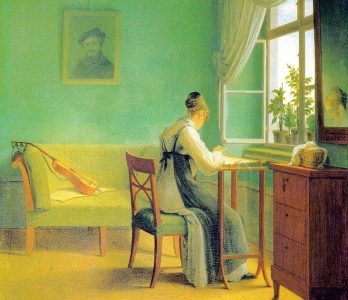
1. Lead White
Let’s start with an obvious one. Lead white is a thick, fast-drying paint that produces a rich, creamy, off-white color that was used already back in Ancient Greece and Egypt.
You can probably already guess why it’s bad for you. It’s that “lead” part of the name.
Lead white is easy to manufacture, as you only have to soak lead metal in vinegar and scoop off the white goo that forms on top. That same white goo will give you lead poisoning if you ingest it, touch it, or even breathe near it.
For ages, lead poisoning was known as “painter’s colic” because so many artists ended up poisoning themselves. Yet, lead white was used all the way to the ‘70s because there really wasn’t any other shade like it.
2. Fiesta Red
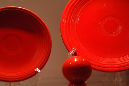
In 1936, the Fiestaware ceramics company introduced a revolutionary line of dinnerware. They became a hit due to their bold, orange-red color — dubbed Fiesta Red — which was formulated with a secret ingredient.
That ingredient was uranium.
To be specific, the Fiesta Red dishes contain uranium oxide. This stuff is radioactive and emits alpha, beta, and gamma radiation in amounts large enough to trigger a Geiger counter.
In 1943, the government banned the civilian use of uranium oxide, and Fiestaware stopped making the dishes. They reintroduced them in 1959, having switched to much safer depleted uranium.
Look, it’s marginally less radioactive, okay? The company finally stopped producing its radiation hazards in 1972.
3. Vermilion
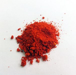
Ah, vermilion. This intense red color has been used for thousands of years in some of most famous paintings and architectural works of Europe and China.
The secret behind vermilion’s vibrancy is in cinnabar. Want to know another name for cinnabar?
Mercury sulfide.
Yeah, vermilion is essentially ground-up mercury. Of course, to get the brightest possible color, you’ll have to grind the cinnabar as fine as possible, so that you certainly breathe it in during manufacture.
Fun fact, Romans loved their vermilion and had a dedicated mine for it in what’s today Spain. That said, mining cinnabar will kill you, so working in the mines was used as a death sentence for criminals and slaves.
4. Gamboge Yellow
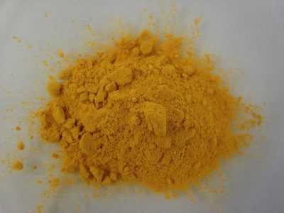
Gamboge (pronounced “gam-boze”) is a yellow color that was used in traditional Asian watercolor painting, in addition to dying the robes of Buddhist monks. It’s made from the sap and/or gum of the Garcinia tree, which grows in Southeast Asia.
You’ve probably already guessed that gamboge is toxic as hell. It’s not as bad as some of the stuff you’ve been reading about, but you definitely don’t want to be exposed to it for extended periods.
On top of its toxicity, gamboge fades fast, so it eventually fell out of widespread use. Still, the Winsor & Newton paint company did manufacture it until 2005, when they finally formulated a non-toxic New Gamboge paint.
Speaking of Winsor & Newton, in the 1980s, they started getting shipments of gamboge that, for some bizarre reason, contained bullets and cartridge casings. It turned out that the stuff had been harvested from Cambodia’s infamous Killing Fields, against international sanctions.
5. Scheele’s Green
In the mid-1800s, Victorian England went absolutely bananas for a color called Scheele’s Green. This vivid yellow-green color became the ultimate fashion trend, being used everywhere from women’s dresses to paintings to wallpaper.
Then the horror started.
Within an hour of donning them, ladies in their dresses got nauseated and their skin broke into blisters. Entire families vomited streams of bloody green goo in their green dining rooms. The whites of artists’ and factory workers’ eyes turned green, and they complained that all they could see was green, green, GREEN until they dropped dead.
That’s what happens when you lace your clothes, your walls, and your entire living environment with arsenic. The main ingredient of Scheele’s Green was copper arsenite, which contains plenty of one of the world’s infamous poisons.
Yet, despite all this, fashion-conscious Victorians kept using the color until the end of the 19th century.
6. Radium Green
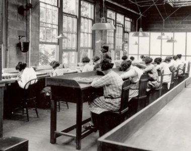
Let us tell you about the Radium Girls. They were women whose job in the 1920s was to paint watch and clock faces in a bright, self-illuminating green color.
The intricate painting they were expected to do required brushes with a very sharp point. So, the ladies started licking the tips of their brushes to keep them fine. It’s okay — their employers told them the paint was perfectly harmless!
That paint was called Radium Green.
Within weeks, the Radium Girls developed acute radiation poisoning. They developed painful sores on their faces, their teeth and jawbones rotted out of their skulls, and many died before anyone figured out what was going on.
Well, anyone except the companies producing the watches and clocks. They knew full well how deadly Radium Green was, but providing the Radium Girls with a safe working environment would’ve just been so expensive.
After dozens of women had died, lawyers finally picked up the case. The Radium Girls won — but the meager compensation payouts were of not much use for the deathly sick.
Radium Green was used until the 1970s, although the manufacturers no longer instructed their employees to lick their brushes.